I thought I would show something that causes me a great deal of indecision. I work in both Adobe Illustrator and Photoshop pretty extensively. Both programs are great for what they do. But they are different.
Photoshop is a pixel based program. Pixels are squares or rectangles that are black, white, gray or color. Reducing and enlarging art made with pixels can cause problems. If you make a 200 x 200 pixel image in PS and need to make it a 1200 x 1200 pixel image you will have a fuzzy image when it is enlarged. That's because you only have 200 pixels, or dots to work with, not 1200. The program looks at the pixels and tries to duplicate them to make the change. Which is fuzzy. It's like a digital camera. You have a optical zoom which uses a the lens to zoom in, and an digital zoom, which uses software to guess what color pixels are needed to make the image larger. Reducing a PS image is easier as you can imagine.
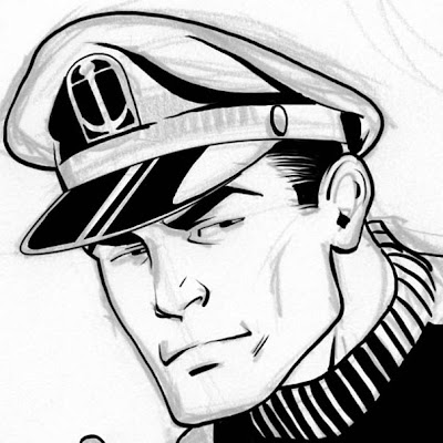
When using a raster program to digitally ink, there are many things you have to think about. Like traditional art, you want to work larger than print or at least a higher resolution. Though you can use the pen tool and other tools for clean smooth lines, for the most part PS is very free form. Much like traditional inking with a brush. Below is a partially inked panel of Captain Action. I did this in PS, using my rough sketch as my guide. Much like pencils are the guide for inks on paper. There is some unevenness that happens with the lines, much like traditional inks. Zooming in to work can be a problem in that everything can get a little fuzzy or jagged. Like ink bleeding on paper. Not a crisp line, but fuzzy as the ink seeps into the tooth of the paper. Zoom back out, and it looks good. Everything but the brim of the hat was done with a brush in PS. The brim was done using a pen tool which allows me to make a bezier curve and assign a stroke to it. It's a flat weight line when finished. If I do this job right, you would assume that this image was done traditionally.

Captain Action ©2010 Captain Action Enterprises. All Rights Reserved.
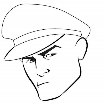
On the flip side, Illustrator is a vector program where the elements are mathematically defined. Enlarging and reducing a vector image does not affect it's quality. Inking in Illustrator requires shapes to be made and filled in with color. (Color=black/white/red/blue/gray/etc) Unlike PS where I can just draw, in Illustrator I have to plan things a bit differently. The image below is Captain Action partially inked in Illustrator. The shape of the hat is done with a pen tool making bezier curves. You will notice the line is flat. There are a dozen ways to make it have the thick and thin lines of a brush stroke, but I can't just draw it and have the control I have in PS or with a brush. But look at the eyes. Crisp. Sharp. Very "graphic" looking. They were done using the pen tool to click and create points to make a shape and fill with black. I like the sharpness of the eyes here. The shape of his face was made with custom brushes. The brushes were made to have that tapered look you get from a brush. But you don't have much control. The widest part of the stroke will always be in the middle. Unless you make a custom brush that has the widest part somewhere else. But it will always be in that spot. Not much you can do. The nose and mouth were done with a pencil tool. With it I make a shape in a free hand fashion and filled it with black. Again, a different approach to digital inking. If this were finished, it might look computer generated. It might come off a little "cold".

Captain Action ©2010 Captain Action Enterprises. All Rights Reserved.
Personally I don't think one program is better than the other. They both have some qualities I like. I can make a final image in Illustrator look like a traditionally inked job. I do that everyday. You would be hard pressed to tell the difference if you held up what I recreate in Illustrator to the original printed art. But it's a longer, more precise process to get that natural look.
I haven't worked in Manga Studio enough to form a strong opinion about it and what it can do. So far I am impressed but I have created anything of substance using the program. When I do I'm sure I will see the strength and weakness of it. And then I will have a third program to add to my dilemma of digital inking. :)
This is Post#865

6 comments:
Thanks for the "Inside the Inker's Studio" episode Gene. I never considered the intricacies of working in the two different programs. But as you say, both look great in the hands of a skilled draftsman as yourself.
Gene, I've been drawing in Illustrator for some time now, and I've done a couple of tutorials to show the method of my madness in handling line work. Not to plug my own stuff, I'll just provide a link to my Deviant page that shows two ways I draw in vector:
Drawing with Lines
Vector Breakdown
Love the insight. I check in to your blog daily and am never disappointed.
Glad you enjoyed it Royce. Now, staying with the theme of Inside the Actor's Studio, do you want to know my favorite curse word? ;)
LUD! - Thanks for the links. You cover a pretty similar approach. I started working in Aldus Freehand back in 92-93 and Illustrator since 93 doing illustrations for higher education books. The are a lot of great things added since those early days (editing in Preview mode, thank you very much!) but the basic principle is still the same.
Issac - Thanks for visiting and posting. I'm glad you enjoy the blog. :)
Guess that it comes down to what the final customer wants. The Illustrator program looks like it is more appropriate for a text book, while the Photoshop seems more comic related and warmer in emotion.
Gary
Gary - Exactly.
Post a Comment