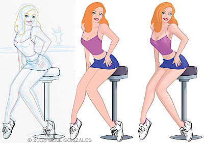
This is the last piece of art for my July package from CILM. Today I decided to work a little differently. I like to mix it up in order to challenge myself from time to time.
I did my initial sketch in my sketchbook in blue pencil. I opted not to ink it. Instead, I scanned it and then brought it into Adobe Illustrator. Illustrator is a vector program. In the simplest terms, you have to make the shapes and fill them in order to create the art. Photoshop on the other hand is a pixel based art program. You "paint" the pixels. There is an advantage to doing vector versus pixel that I will explain in a moment. So, the image on the left is my sketch on a layer under my work layer. I had to outline each sketch line and fill with a color. I am making my bold and thin lines this way. In Photoshop I would just paint the lines, much like using a brush and ink in the real world.
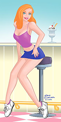
 The middle image above has the outlines complete. I filled everything (legs, clothes, etc.) with a base color and then copied and pasted the image into Photoshop. From there I started establishing highlights and shadows. When that was done, I started over and repeated the process with the background. When it was completed I brought that into PS and put it on a layer behind the girl. Touched it up, adjusted the saturation, cropped and saved. Below is the final art.
 I could have done everything in Illustrator if I chose to. It would have looked slightly different because of color shifts between the two programs, but still would have been fine. The advantage to doing the art in a vector program is that you can enlarge the art as big as you want. A two inch by 2 inch piece could be enlarged to 20 feet by 20 feet or more, if you want. I believe the way they explain it is a vector program fills the area mathematically. While in PS, if you paint 10 pixels and you enlarge them, the program doesn't enlarge the pixels, it can't, it just adds them, guessing what the colors should be. Thats why if you enlarge a PS image or photo, it gets blurry. There are ways around it but this will suffice for the point I am making about the two programs. I hope it makes sense. There are others that can explain it better the me. Hope I didn't bore anyone. :)

4 comments:
I'm a huge fan of your stuff, so it's sad that my first comment on your blog is about Illustrator vs Photoshop.
But I've wondered why people love Illustrator for a while now and this is the first explanation that's actually made sense to me.
Very well explained Gene. For the older guys (like me), remember the way computer fonts used to be. If you wanted Times New Roman, a standard font, to be really useful, you had to have about ten versions of it installed...a 10 point version, a 12, an 18, a 24, etc. Otherwise, the computer tried to scale the font itself, usually with terribly blurry results. Then the vector based fonts replaced them and we have only the one version that can be scaled to almost any size and still look crisp as the computer creates the type based on a mathematical algorithm. Ah...the 80's and early 90's...gotta love them!
Oh, nice pic, as usual.
Hi Michael, Thanks and welcome! I'm glad my explanation cleared things up for you.
Royce - Yikes, I forgot about those days. Thanks!
Gene,
Agree with Michael, great explanation on the differences between Illustrator and Photoshop programs.
Also, I love the fact that Illustrator has the potential to get a 20'x 20' poster of your work (hey, there is an idea!!).
Gary
Post a Comment